Friday, 5 December 2008
My environment animations
Well animating this was surprisingly easy, Maya said no to me when I tried to upload the sky dome coloured environment file, so I had to open one of my earlier files and rotate the propellors to where they are now currently facing. I had the farmes spaced out so that it would rotate slowly, which I'm proud of. The same principle is with the doors, I also tried to provide a little alteration in movement with them. One more thing about this, there was a issue with rotating the doors. When I rotated it first time the door moved as though it wasn't on any hinges, I realised that this is because the pivot of the rotate tool was placed in the middle, so I moved the pivot point (by pressing insert on the keyboard) and moving it to the middle but where the hinges would be placed. This worked successfully, thank God.
Booyashacka
Thursday, 4 December 2008
Tuesday, 2 December 2008
WANTED (No not the movie)
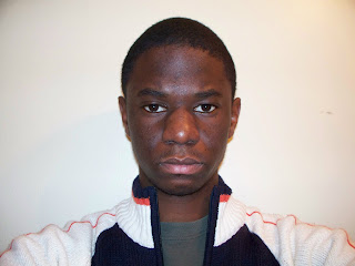
Well guys, since we are considering putting our pictures as an opening or credits as wanted posters, I did a little experiment tutorial, so here we go. First here's my picture. Make sure you double click on the background layer to unlock it, call whatever you like.
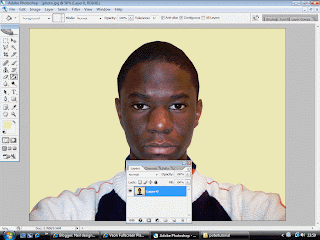
Cut around your pic then, delete it. Next you colour the cut out selection, MAKE SURE YOU CREATE A NEW LAYER for the colouring, if you want to change the colour. Next use the rectangular marquee tool to cut the edges.
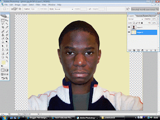
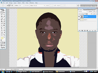
Alright to get this, go to filter at the top, then go to artistic, then cut-out. Mess around with the edge simplicity, edge fidelity and number of levels. I only touched number of levels and put it on number 5 because It brings out those highlights and I plan to cut them out.

Alright to get this, I used the magic wand tool to select all those highlights, including some on my jumper. MAKE SURE YOU ARE ON YOUR LAYER PICTURE. Afterwards go to image-adjustments-Hue/Saturation. Slide the Saturation all the way to -100. Use the magic wand tool to select the dark areas and the colour them black. It's optional though. Which you think looks better?


Saturday, 29 November 2008
Finishing touches to maya
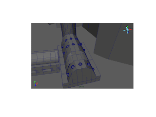
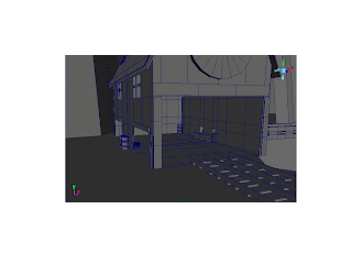 Well gents I've added some final touches to the refinery building and to the generator. I first took some of Sam's planks to fit on the edges of the building but the rotate tool was jerking with me. So I made my own and put some on the edges, after that I made a little table inside so that people can store stuff in there. I'm wandering if I have to create a plane inside the conveyor to make it look as though things can move along in there? Anyways I did the windows aswell and I mad some minor flashy improvements to the gerenator by using half cut spheres, let me no what you think. Damn! the supports...ah I'll do it tomorrow when I test out lighting and colouring.
Wednesday, 26 November 2008
New Updates!!
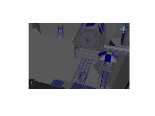
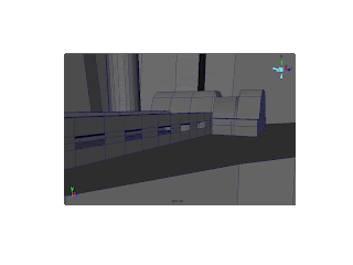
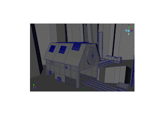
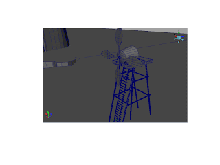 Things have been a bit hectic, as I'm sure you all know we have gone through trial & error, losing hope, gaining hope, trial & error, panicking (me anyways) maya problems, and back to gaining hope again. But anyways enough of my complaints, let me show y'all what I've done. ^_^
For the first pick I've finally done my windmill, it took me ages to do while using the reference. However I encountered something cool by accident while creating the body, earlier today. I accidentally created someting that looks like where the fire comes out of a rocket, don't know the name, but it served its purpose well.
The second pic, well I though I'd try and find and import my original refinery building but considering the problems we encountered with with my model before, I mad a few modifications to the building, Sam placed next to his storage building. I actually like it more than my previous one.
The third pic, I looked at the refernce I had of the coal refinery I have and based the shape off that. I deleted the block I had next to it, figured that the overall design and shape made more sense. Hopefully if we get through this we can add some ligt in the conveyor belt, to give it some idea of heat. Just remembered, forgot to add some supports.
Finally the fourth pic, the tracks. Not much to say the pic is self explanatory, but I'll just say that I created eoungh space for both tracks to pass through and two other entrances on the left side of the building.
That's all for now, peace.
Subscribe to:
Posts (Atom)


